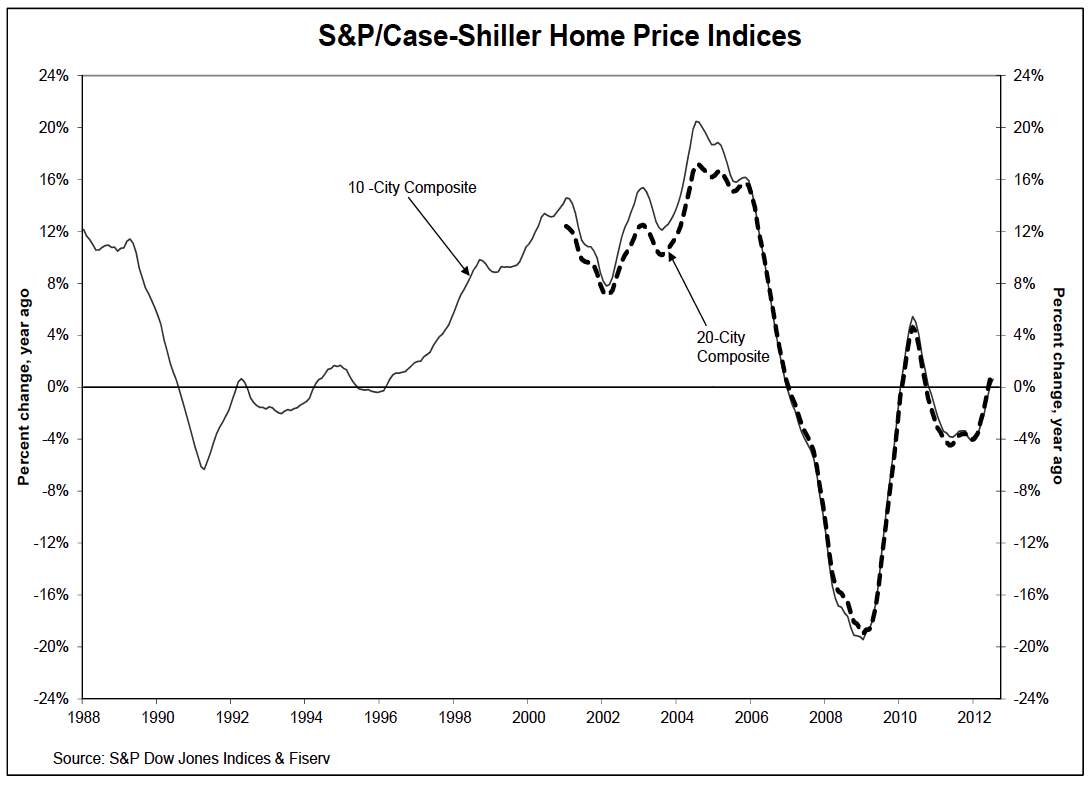
I like this index chart from the report (2nd chart presented in their report) better than the more commonly used % based chart (1st chart presented in their report) because it provides better context. The recent trend is clearly a small see-saw but still sliding in general. I’m not a fan of the CS index for its 5-7 month lag but since it’s some sort of gold standard for housing, it’s important to point out that this clearly shows housing remains tepid at best.
But more importantly…
Shortly after the S&P/Case Shiller report was released this morning at 9:00am, I got the following CNN Breaking News email at 9:15am:
Home prices in 20 major U.S. cities rise to highest level in nine years, according to a new report.
I just about had a heart attack, wondering how I could be so far off in my assessment of the housing market. However I opened the report and the numbers didn’t show that kind of gain.
At 10:21am I received a followup email from CNN Breaking News:
Correction: Home prices rose in July to their 2003 level, but remain lower than the peak in 2006. CNN’s previous alert erroneously stated that home prices had risen to the highest level in nine years.
Not to single CNN out since this has happened at ABC, Breitbart and Fox.
Speed comes at a price: Accuracy.
Similar phenomenon in the appraisal business. The absurd speed demanded by retail banks and AMCs of their appraisers even after the “lessons learned” in this credit crunch, attracts the wrong kind of appraiser. Speed still trumps accuracy.
_________________________
Home Prices Increase Again in July 2012 [S&P/Case Shiller]


