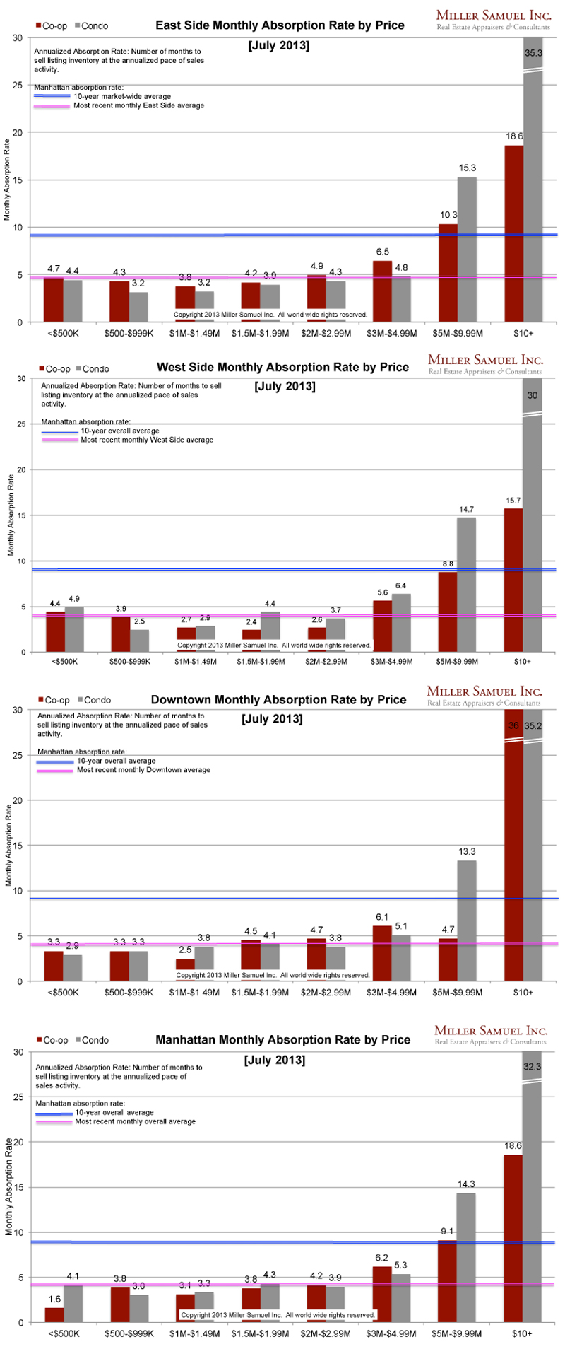
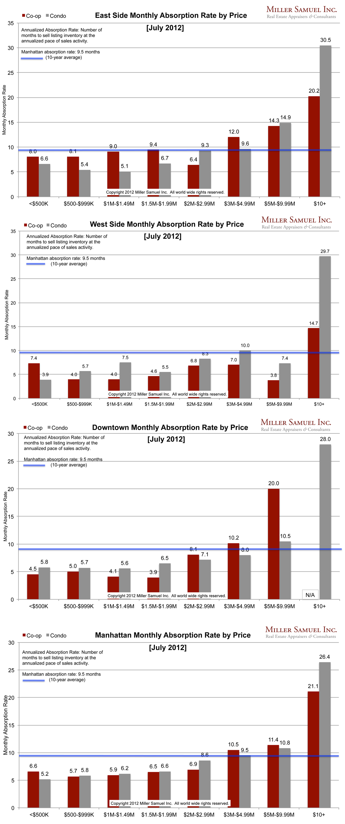
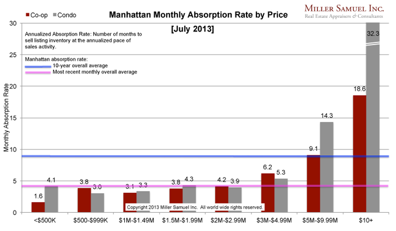
Absorption defined for the purposes of this chart is: Number of months to sell all listing inventory at the annual pace of sales activity. (The definition of absorption in my market report series reflects the quarterly pace – nearly the same)
I started this analysis in August 2009 so I am able to show side-by side year-over-year comparisons. The blue line showing the 10-year quarterly average travels up and down because of the change in scale caused by some of the significant volatility seen at the upper end of the market. The pink line represents the overall average rate of the most recently completed month.
Side by side Manhattan regional comparison:

 [click images to expand]
This month I began to make the Y-Axis fixed in height so better side-by-side comparisons can be made in the future. The disparity in pace of the market between the $5M+ (slowing) and the remainder of the market (brisk) widens. An exception to this seems to be the co-op market from $5M to $10M which is absorbing at an average pace while the condo market in the same price range is moving much more slowly. This is likely because re-sale units are competing with the surge in new condo units entering the market (most won’t start closing until next year) and are often over listed, influenced by the new dev pricing even though buyers view new development with a premium value.
_______________________
Manhattan Market Absorption Charts 2013 [Miller Samuel] Manhattan Market Absorption Charts 2012 [Miller Samuel]
One Comment
Comments are closed.


Is there actually a weakness in the Manhattan real estate market? For the 10+ million dollar properties, the absorption rate is up there. Question is, how many of these places are grossly overpriced or is this segment of the market showing weakness.